
Padilla recently hosted a POV webcast event about how to use data to uncover communication insights, and as the SMS Research Advisors lead, I had the pleasure of moderating the conversation. I was joined by Mike Callero (VP at Allina Health), Khary Campbell (Head of Insights for General Mills) and Becca Young (SVP, Strategy + Integration for our sister agency National PR in Canada).
Our guests provided great insight into the connection between data analytics and marketing communication. With their various industry backgrounds and array of experiences, both client-side and supplier-side, we heard a lot of ideas on how best to utilize data under different circumstances.
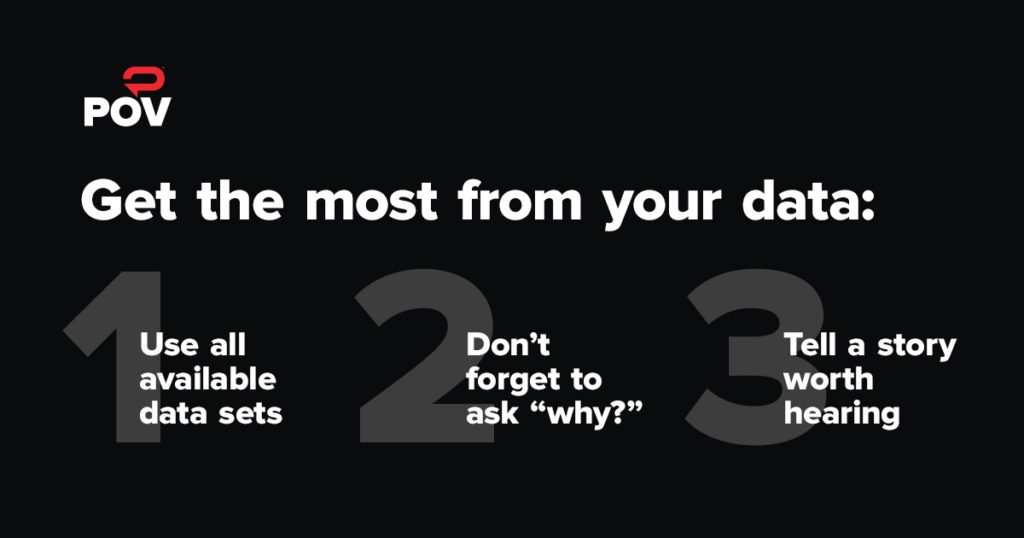
You can catch up on the POV discussion here to learn new perspectives and ideas on how to approach analysis. But for now, here are my three key takeaways:
- Use all available data sets. A big misconception about data analysts is that they only want to work with huge databases with lots of numbers! However, our POV panelists pointed out that insights can come from the most unique and nontraditional places. For example: conducting interviews, monitoring social media conversations and observing consumers’ behaviors. Khary recalled a process where General Mills examined store receipts not only for food purchases but also non-perishable items like toothpaste and paper towels to better understand their potential customer.
- Don’t forget to ask “why?” This seems like a no-brainer, but data analysts are just as guilty as everyone else about this. It’s often easy to say that the data reveals something very obvious and that there is nothing more to it. Mike provided perspective on how always asking “why” drives the insights you thought you had to a new level. He advised not to get too comfortable and be satisfied with what you think you see. Always drill past the obvious answer, because that often leads to the most valuable insight. Remember to stay curious and work the data you’ve got!
- Tell a story worth hearing. We were all in agreement that data itself is useless unless it can be presented in compelling way. Becca acknowledged that poor data visualizations are out there, but it provides an opportunity for the artists and strategists to raise the standard for communication and understanding. A table with a bunch of numbers may only interest a few and will probably be meaningless for most. Get rid of the side-by-side pie charts and make your data come to life in a visual and meaningful way.
One of the ways that we help brands and organizations tell a better story is with our Path To Action model. Connect with us to learn more.